Greetings, and welcome to my exploration of Dance in the world of fashion - using two beautiful Vogue editorials, and a few extra tidbits.
It feels like a while since I posted - but the irregularity is only going to get worse. Sunday, you shall have another!
Anywho, does anyone who reads Vogue (the british one) remember this editorial from August 2011? I remember it as one I actually really liked... not only because of the beautiful clothes, but because of what I considered to be a great concept. Arizona Muse modelled every outfit - coincidentally, she is on the cover of February 2012 Vogue, and looked more than usually gorgeous in certain costumes.
Maybe what I loved the most about this editorial, and why I flicked to look through it a number of times, was the wonderful variety alongside the beautiful assemblement of everything as a whole. From couples dancing Fun Jives, elegant Foxtrots and sizzling tangoes... to 70s-style Divas. Not, of course forgetting, Arizona Muse in a beautiful ballet-inspired costume while real-life ballerinas on either side of her strike impressive poses.
Also not forgetting, bien sur, Jean Paul Gaultier's fantastic semi-can can, semi-burlesque (which in terms of outfits, is hard for people like me - who honestly don't really see much can can or burlesque - to judge which of the two it is. I would lean towards something more burlesque)
Of course, I would state that Fashion has always greatly influenced the ballet - and vice versa. In 1924, Coco Chanel designed the costumes for 'Le Train Bleu' (probably a ballet less known in popular culture, but inspired by Agatha Christie's 'The Mystery of the Blue Train', with a story by the brilliant Jean Cocteau and a curtain painted by the legendary artist Pablo Picasso which, on top of the Coco Chanel having designed the costumes issue, would make this Ballet something I would kill to have seen the original of... and I am certain I am not the only one.)
Anyway, so if this editorial showed a delightful fantasy of dance and ballet, the following one was quite different. Although it had the same title, it was a lot more bitingly realistic, in both clothing and with drastic photography.
See what you think - Sasha Pivovarova transformed into a dancer, for Vogue Paris , December 2011.
So, which do you prefer? To a certain extent, a Biting Realism or a more lyrical fantasy I think the two sets of photos show two different sides to the same world of dance and of music. Backstage vs. the glittering lights. The costumes, the glamour and the elegance vs. the hard work, training and physical strain?
I would write more, but am severely exhausted. I will simply serenade you out with a little David Bowie. Not because it has anything terribly to do with either of the editorials, but because I love Bowie's music and the title is the same Let's Dance!
I hope you enjoyed reading this. Please comment (for example, which editorial do you prefer?) Do follow if you like.
Greetings! I apologise for my temporary absence and I was meaning to post this last Friday, but have had other things on my plate at the moment. *Sigh* Anyway, before Christmas I was going to do a review of the Perfume Adverts I had seen, but now I have simply chosen to present my top ten favourite Perfume Adverts I have ever seen - even a few that were made before I was born. Admittedly, this is certainly not helping me with my saying 'No' to persuasive shop assistants problem. Honestly, all a shop assistant has to do with a Perfume to get me to buy it (as long as it smells fine and has a lovely bottle shape) is to say 'You really need this.' or 'It's a Limited Edition Bottle.' Next thing you know, I'm telling myself 'Yes, I do need this.' and fishing out my purse to buy something I can ill afford.
Yet, at the same time, I'm on the School Debating Team. Why do I not simply apply my questioning, probing nature in Real Life Situations? Why? ... (Because I am helping keep the economy afloat)
1. Lou Lou de Cacharel - 1988 - I love the simple beauty and elegance of this video, but it's real selling point for me was the moment when she looks up and answers the call, 'Lou lou?' with 'Oui C'est Moi.' Inexplicably perfect moment and, although it took me a while to choose which of the ten adverts I have picked to put at No.1, it had to be this. Here is the clip and, although it plays the advert twice and is in English (it is more beautiful in French) I chose it because of the Higher Quality.
2. Egoiste de Chanel pour Homme - 1990 - This advert is purely brilliant. With Sergei Prokofiev's Dance of the Knights, filmed by Jean-Paul Goude, a building purely created for the advert (a copy of the Carlton Hotel in Cannes) and many beautiful women dressed in Chanel shouting, "Selfish ... Where are you? Show yourself miserable! Beware my wrath! I will be relentless. O rage! O despair! O my love betrayed? Have I lived so long for this infamy? Show yourself selfish! Selfish! Selfish! Selfish!" (I felt the need to translate for my English Readers) How could it be anything short of 'une merveille?'
3. Chanel No.5 with Carole Bouquet (I believe the date is 1986, but the Internet is failing me) I feel almost guilty for not putting this higher, because I have quite literally watched this dozens of times and have never tired of it! It is probably personal preference, but I think it is the best of the three Chanel No.5 Adverts with Carole Bouquet, surpassing the fantastic 1994 Marilyn Monroe Metamorphis and the earlier one with Nina Simone's 'My baby just cares for me' in the background. I find it absolutely beautiful and (once again) felt the need to include a translation of the dialogue for English Readers before... Ha ha ha! ... I found a clip from the film Gilda (1946) with Rita Hayworth that I can just add on underneath instead. Saves me time and adds a beautiful clip to the proceedings.
Here is the Gilda (1946) clip I promised - Do you see the similarity?
4. Rive Gauche de Yves Saint Laurent - 1980 - The advert for this one is one of my more recent discoveries. Although I had come across the perfume before, I had not thought of trying to find an advert for it until recently... and when I did, I was blown away. It is so French and Sophisticated, not to mention light-hearted. The way we heard the sound of her spraying the perfume as the man was speaking is wonderful; even if I had been feeling utterly miserable (probably realising I had spent too much. Again) it would have cheered me up.
5. Chanel No.5 with Audrey Tautou - 2009 - Yes, I have posted a third Chanel advert, and had to restrain myself not to post another one. Namely, the fantastic concoction with Vanessa Paradis in a Bird Cage while a cat looks on hungrily and Coco Chanel stares out of the Window. *Sigh* Unfortunately, I must state that if I had posted that, this list would have lacked the variety I was trying to get (and semi-failed at getting) Anyway, here is the gorgeous advert you have probably all seen, in all it's two minute long glory.
6. Paris de Yves Saint Laurent - 1998 - Another beautiful advert, though I should probably stop stating that, since they all are. What I loved about this one was a mixture of the music, the model's hair and gorgeous pink & black dress, the fact they are standing at the top of the eiffel tower, the elegantly gloved hand at the beginning and end, the helicopter.... in short, the advert as a whole. I find it deliciously charming and I adore the colours, especially when the model's eyes flick up to reveal how beautifully blue they are. Sincerely, only the second video I have ever watched that made me briefly wish I had blue eyes (the first was, of course, Isabelle Adjani's Pull Marine)
Anyway, here is the advert.
7. Candy de Prada - 2011 - Mwahahaha! I shall be controversial. For some reason beyond myself, there are many people who dislike it. Now, although I might initially have been turned off by any perfume called something that sounds as sweet and as sugary as 'Candy', I was instantly converted when I saw the advert. To quote, "Prada Candy's advertising campaign for television stars Léa Seydoux, rising darling of French cinema, as an impulsive piano student who seduces her tutor with a provocative dance. The preeminent fashion image-maker Jean-Paul Goude directs the Prada Candy movie. Seydoux's hypnotic dance is inspired by the Apache dance, performed by street gangs of 1900s Paris. The dance is intense and fierce, expressing a primitive battle of passion between a man and a woman; a battle the woman often won."
Without having even seen it, I could have read that description and known it would have appealed to me. I love the opulence and Léa Seydoux looks so cute and elegant in her black dress with Pink Knickers. Who would have guessed all that could have come from a fragrance called 'Candy'?
8. Midnight Poison de Dior with Eva Green - 2007 - This one is one of the adverts that has grown on me, rather than appealing to me straight from the beginning (although I never found it unappealing) and I must say, I like the advert a lot more than the perfume, which is very entêtant, and there is no better way to describe it than that. I distinctly remember a point when I was young and foolish... and spent half an hour on the ferry from England to France, with my sister, trying all of Dior's various Poisons. Absolute Recipe for Disaster in a crowded car that has a good few hours on the road still to go before we reach our destination.
Anyway, returning to the advert: I really do not think there could be a lot which is much better than Eva Green in a Midnight Blue Dress with Muse in the background and a clock ticking. I will also add that I am not generally a fan of the more 'sexy' adverts. What do you think? What do you think of using Muse for the music?
9. Pour Elle et Lui de Jean Paul Gaultier, Le Baiser - 1997 - This is another one that is slightly out of my 'perfume zone' so to speak. I think that, like Lou Lou's 'Oui C'est Moi', the selling point for me in this instant, was the perfectly phrased 'Tu sens bon, tu sais?' followed by the look they give each other. Not only that but, although I am a semi-traditionalist in this regard, I do like the gender bending; the way the woman takes the lead role. It makes it all the more memorable. This advert is stylish, sexy and very Jean Paul Gaultier! How could I not love it? On a last note, I love the colouring and think the blue light is perfect, as well as the way it is beautifully shot and think the music in the background balances everything else perfectly. It adds a note of class.
10. L'Air du Temps de Nina Ricci - 1995 - This should probably be a lot higher. It deserves to be a lot higher and is a true work of Art. However, everything was so close run and I can not forget that when I first saw this ad quite a few years ago, it really semi-bored me.
Now, I look at it as a sort of heavenly, sensual romance. I find it fascinating, with a strange, delicate and beautiful mix of what I would suppose is French and Indian Culture, even if it is a little 'creepy'.
I really can not explain it very well to be honest. Just watch, and I hope you will understand. Oh, and the woman forty seconds into the video is one of most beautiful things you will see, which also manages to be scary (another example of this is Johnny Depp in Edward Scissorhands)
So... now I have told you all the perfume adverts I have absolutely adored, I think there is space for one I have really not liked. It is quite popular so maybe I have misunderstood it. Anyway, here is the atrocity.
THE WORST PERFUME ADVERT (excluding adverts for celebrity fragances. They do not count)
Parisienne de Yves Saint Laurent featuring Kate Moss.
What on Earth is she doing to that poor Flower??? I do not even wish to know.
Kate Moss is not even remotely French, so why is she the face of a perfume called 'Parisienne'? They should have used a French Woman.
Admittedly, I like the guitar riffs.
It is an inelegant advert with no defining feature (apart from that it looks like Kate Moss is...)
The Perfume is not actually that bad, but this Advert would prevent me from ever buying it.
If you do actually like this perfume Advert, do not hesitate to comment, as long as you state your reasoning. Who knows? I could be convinced.
Anyway, thank you for reading - Do not hesitate to comment and, if you liked this post, then please Follow to see more. :)
Greetings to all the readers of this, my blog. As I write tis now, I would say that I currently look like a half-drowned zombie with wet hair and mascara smudges under my eyes. I am about to make my first (and quite probably only) analysis of one of the 2012 Pre-Fall Collections. Having looked through them not so avidly, I have decided that the collection I have decided to do a brief summary of is the Preen one... though you might have guessed that by the title. Oh, and I am also going to include one random, completely unrelated Music Video from a singer I have only just discovered called Kimbra. Now, I am not claiming that my knowledge of the world of modern pop music is in any way exemplary (or that this song is a work of musical genius) but I had never heard of this singer before and thought her music rather good, especially in comparison to other rubbish in the charts currently. Therefore, I have decided to share!
I am quickly going to warn you that this might not be worth reading (but please, do read it anyway!) and I briefly considered changing the font size to 'large' so the page would fill up, before I realised that it just look grossly unaesthetically pleasing. *Small sigh*
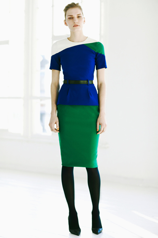
So, what can I state about the Preen 2012 Pre-Fall Collection? Well, out of the twenty-nine different outfits, I have chosen thirteen of them - my favourites, but naturally taken from the collection on fair ratio to fully exhibit the different styles.
The model is the dutch Marique Schimmel, listed on models.com as being #49 of the top 50 working models (naturally, nobody outside the world of modelling has a clue who she is, which has become perfectly naturally. Indeed, the only model non-fashion obsessives might have heard of is #1 Lara Stone)
So what could be expected from this collection? I naturally liked it to some extent, otherwise I would not have posted this, and it is constantly growing on me. There are almost two different aspects to the collection. Firstly, the geometric shapes and colour blocking, orange and black, in the first half of the collection... flowing rapidly into the other aspect. Thea Bragazzi, the designer, states that she visited her family in the Isle of Mann and was inspired by her grandmother's china. Indeed, to quote, "She has all these blue-and-white teacups, stacked up, which look incredible!"
The Impressive result of this is the beautiful china-patterned prints on silk dresses and blouses, with an almost blown-up Wedgewood pattern, not to mention 'denim' printed silk.
Bearing in mind this is simply an inter-season collection, I found it thoroughly good... I only wish I could find buried treasure in the garden somewhere and so be able to afford one of the two gorgeous orange and blue dresses right at the end. Or maybe the dress straight on the left, the gorgeous number I would call the semi-anomaly of the collection (while at the same time meshing perfectly with it)
Well, here is the video I wished to show, and although it is not one of the better videos I have found from Kimbra, I felt the colours fitted in better with its surrounding pictures, even if it is simply because it has a white background and colourful clothing (Talking of which, and I know certain people would heartily disagree with me, I adore the dress Kimbra is wearing in the video. She pulls it off so well!)
Brief Information about Kimbra: She is twenty-one year old singer/songwriter from Hamilton in New Zealand but currently based in Melbourne, Australia. Her debut album, Vows, was released on 29 August 2011 in New Zealand, and 2 September 2011 in Australia on Warner Bros Records Inc.
Her genres are described as soul, alternative and jazz. I hope you enjoy.
I hope you have enjoyed reading my hastily scrambled together Post, and if you did not actually read it thorougly, you might have appreciated the photos included or the Kimbra video.
Remember to comment (Sincerely. Do. Comment.) and, if you like this, then feel free to follow.
Salutations! You are about to embark with me on my exploration of one of this season's most prominent Fashion Trends. A fifties Americana. In general, this is less the ladylike fashions of last season and a more youthful and colourful 50s vibe... the type that films like 'Grease' looked at twenty years later. So, in the spirit of the whole affair, I have put together a collection of items that remind me of 50s America in all it's forms - here's hoping the cadillac is indeed a 1950s one. Whereas I am (more or less) competent at judging what era certain clothes come from, my knowledge of cars is a lot more painfully limited. I have also included a trio of videos (with some great songs)
Off we go with a 'Bop bop-a-lu a whop bam boom!'
I will briefly look at the 1950s in two three prominent ways:
Firstly, it was a time of increased conformity and middle-class values in America, resulting in things such as the Baby Boom and due in part to the post-war affluence of the time where the all-electric home was the ideal. By 1950, about ten million homes in the USA had a television set.
Secondly, it was also a time of change (though that is, in many ways, a ridiculous statement - every time is a time of change) where Rock and Roll came to prominence towards the middle of the decade. Fast Food Restaurants and Drive-in Theaters were built while, in Hollywood terms, the rise of the anti-hero came about with actors such as Marlon Brando and James Dean, 'the first american teenager' taking their place in female hearts. Hollywood catered to a younger generation wanting a symbol of rebellion.
Finally, it was a time of blatant white terrorism in the south (the third Ku Klux Klan, a name desormais used by several groups, began to resist social change and the self-improvement of the Blacks' by bombing transitional neighbourhoods and assassinating activists) Beginning in the 1950s as the african-american civil rights movement organised non-violent protests from approximately 1955 onwards. Politically, the cold war escalated resulting in, for example, the Korean War from 1950-1953 and the solid division of Europe into 'two camps'.
Returning to the Spring 2012 pret-a-porter collections.
At Rochas, Marco Zanini served up, what he described as, "A journey through the vortex of cinema," which, in many ways, it absolutely was - situating him neatly in the middle of the season's 50s trend. Hitchcock-esque moments with egg-shaped coats one could easily visualise on an icy blonde 'femme fatale', say Eva Marie Saint, and dresses which would not have looked out of place on Grace Kelly. However, maybe the defining point of the collection was the deliciousness of the accessories, adding the needed 50s detail, e.g. organza scarves over a demi-beehive, demi-chignon and cat's eyes sunglasses. My only qualm with the collection was a the footwear - now, I am not saying there is anything dreadfully wrong will all of it... and I have seen a review raving about it, describing it as 'especially good' but I am afraid, I was not able to shake off the feeling that a certain style of shoe in particular looked like a cross between a plastic flip-flop and something they give out in hospitals. There is, of course, the possiblity that it looks worse from the front (and the models' feet really do not help) Colours came in soft pastels, and a few delicious B&W then vibrant pink pieces. When the clothes were less silhouetted, the patterning gained prominence.
Naturally, my favourite item in this collection was the gorgeous white dress in the top right corner. Not only because it can be worn as a single piece but because I love the shape and the well-cut & defined lines. I also loved the cat's-eye sunglasses, regardless of the fact that, I believe I remember a time when I beheld every single last pair with absolute horror, although I do not recall why... I suppose I can simply call it one of the many foolish fantasies of youth.
At Prada, the trend was handled somewhat differently:
From the beginning, bold prints (often of the vintage cars of the 50s - muscly *insert name of car I am terrible at recognising here* with flames on their bonnets) were the order of ther day. Both shiny leather and accordion-pleated skirts made their way in abundance down the Prada catwalk. The Midriff area (as shown in the second from the top to the left photo) was also exposed a great deal since the fashionable (and, in my opinion, stylish) waistband is high this season... and there is no reason why it should not be. If a little skin is needed this Spring, try this instead of the more commonplace belly-button area. It is just as alluring and, in my opinion, more elegant. Of course, the Prada collection has, in many ways, a younger feel than the Rochas collection but Miuccia Prada, like Marco Zanini for Rochas, also payed tribute to classical films of the era. In this case, the hilarious 'The Seven Year Itch' with the forever timeless Marilyn Monroe. The afore-mentioned accordion-pleated skirts were in many ways inspired by Marilyn Monroe's iconic white accordion-pleated dress... and this was highlighted by the fact that the models walked over a subway gate on the catwalk.
A note has to be payed to a few other elements of every single outfit on the runway. The first of these elements is the array of amazing shoes and, though I have not posted any close-up photos, they really are something - staggering with a delightful fantasy that simultaneously manages to match the prints, on the pencil skirts in particular, perfectly! Now, if you look to the photo directly to the right, you will see another element of the 50s design at play... the gorgeous lines on this swimsuit are very reminiscent of the time, and create wonderful, alluring curves (in a very Monroe reminiscent way) At least it would, if the model wasn't so flat. Emphasising assets does not really work if you do not have assets in the first place. That aside, it is an absolutely stunning swimsuit and I simply adore this style, which is very flattering. On the right, you have a skirt and top combo showing what is, of course, an easier and looser look. You can see the accordion-pleats I previously mentioned twice.
Finally, a word for the earrings in this collection. Now, I do not really ever pay any attention to earrings. My own ears are not pierced after all and, in photos of this sort, it is easy to miss an earring. Not in this case! I simply had to mention them because I think Prada is the Spring Season Collection with the largest prominence of earrings. There were certainly some rather large, ornate concoctions with gold-rimmed gems hanging from red, ivory and venetian blue roses. The Cat's-Eye Sunglasses also made a return in this collection too.
Prada and Rochas were, naturally, not the only ones to try the 50s trend. Examples of it can be seen at Proenza Schouler (where high-waisted, glossy leather skirts with slits were presented) Nina Ricci (did wonders with the midriff) Jil Sander (a large quantity of plaid) and Marc Jacobs (pencil skirts and checked shirts) to name but a few.
Anyway, here is hoping that those of you who follow fashion can maybe be inspired by, what I perceive as, a really rather fun trend. Those of you who do not... maybe a subtle pair of cat's-eye sunglasses? ;)
Or take your cue from Marilyn in 'How to marry a millionaire' and do it with glasses - it's what Prada did in their pret-a-porter collections for Autumn 2011.
Thank you for reading (I hope I did not ramble on too much and that this makes sense. I wrote it at past midnight and really could not be bothered to check for spelling and/or grammatical mistakes. You will know why if I have substituted you're for your, and are for our... etc. Well, hopefully not that bad. Tiredness is not really an excuse to lose all understanding of the English Language.)
If you enjoyed this post, you can follow. Though you did not really need me to tell you that. Oh, and comment; that is always much appreciated even if it is negative.


 Maybe what I loved the most about this editorial, and why I flicked to look through it a number of times, was the wonderful variety alongside the beautiful assemblement of everything as a whole. From couples dancing Fun Jives, elegant Foxtrots and sizzling tangoes... to 70s-style Divas. Not, of course forgetting, Arizona Muse in a beautiful ballet-inspired costume while real-life ballerinas on either side of her strike impressive poses.